Last week, I introduced the concept of Axis Names. If I counted correctly, there are 19 axis names applicable to one or more of the 14 visualizations in Spotfire. I will go through the axis names one visualization at a time, beginning with axis names on bar charts. Although, I learned very quickly that just because you can use an axis name on a given visualization, it doesn’t mean you should. I’ll show you what I mean by looking at Axis.X and Axis.Color. Read on to learn more.
Blog or Video
Calculations You Can’t See
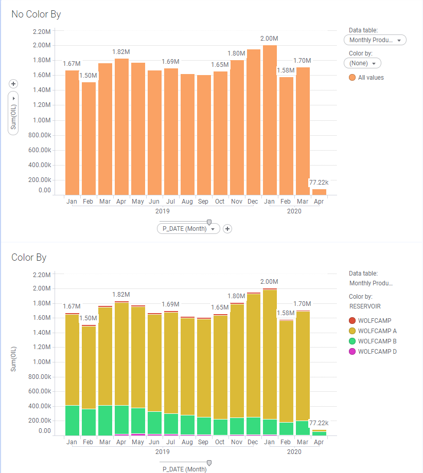
Before we dive into axis names on bar charts, I need to make a critical point that will help with understanding later on. Below, I’ve set up 2 visualizations, one with color by and one without. Both charts use the same expression but they render and calculate differently. In the second chart, Spotfire is using Axis.Color to tell the visualization to sum oil for each reservoir and month, even though you don’t see a reference to color in the expression.
Make a mental bookmark. Now, let’s dig into axis names on bar charts using Axis.X.
Axis.X on Bar Charts
Axis.X refers to the column of data on the x-axis of the bar chart. This data can be a date hierarchy, a categorical column of data, or a categorical hierarchy. I’ll show examples of a date hierarchy and a categorical column of data.
With Date Hierarchy
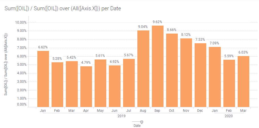
This expression calculates what percentage each month makes up of the total data set. The first part of the expression — Sum([OIL]) — sums oil for each node or month on the visualization. That value is then divided by the second part of the expression — Sum([OIL]) over (All([Axis.X]). Spotfire sums oil for all of the months on the x-axis because I used the All node navigation method. The total of all the months adds up to 100%. Pretty easy.
Expression: Sum([OIL]) / Sum([OIL]) over (All([Axis.X]))
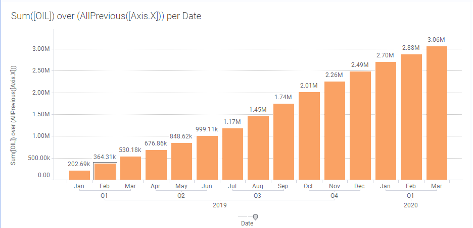
This expression calculates a cumulative sum by summing oil for the month and then adding that to the sum of all previous months.
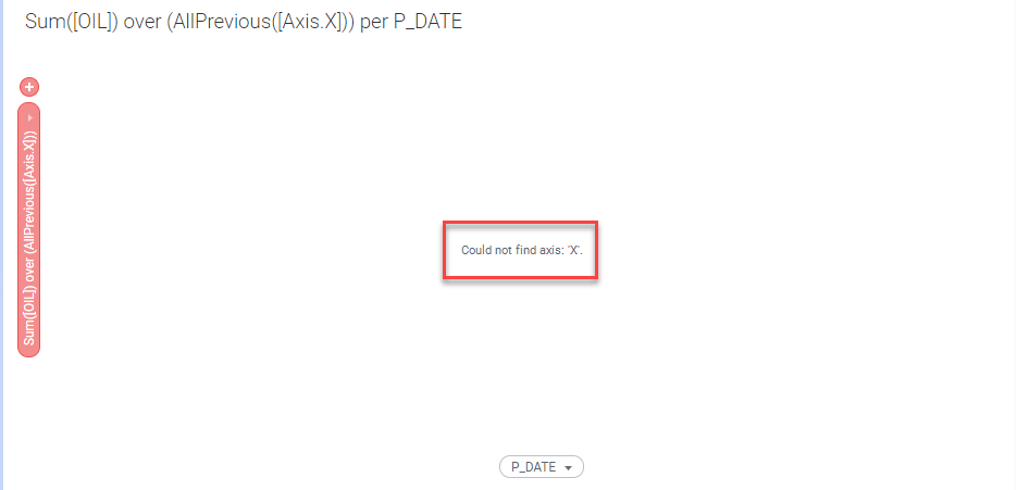
Expression: Sum([OIL]) over (AllPrevious([Axis.X]))
Now let’s look at Axis.X with a categorical column of data.
With Categorical Columns of Data
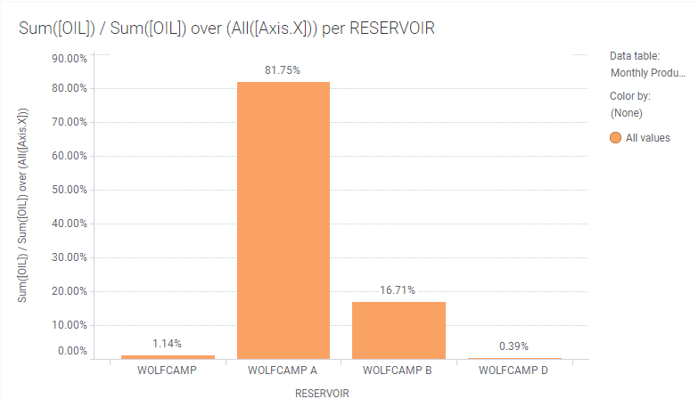
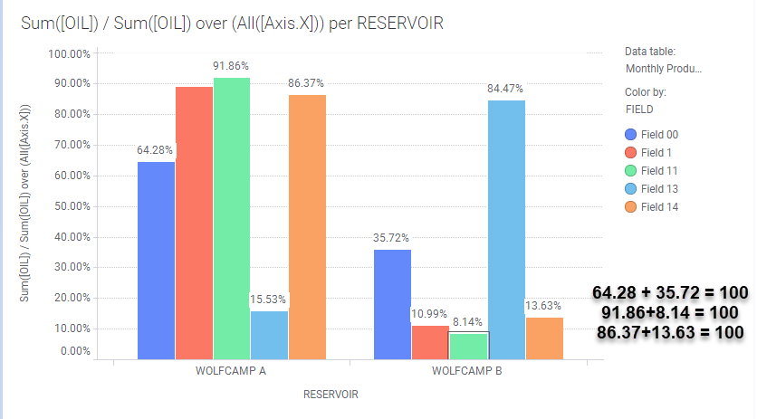
Below, I replaced the date with the RESERVOIR column. The resulting visualization shows the percentage each reservoir contributes to the total. Simple right? Well, what if you want to add color to each reservoir. This is where things start to get tricky.
Expression: Sum([OIL]) / Sum([OIL]) over (All([Axis.X]))
Adding RESERVOIR to the color by selector changes the values. Why does this happen? Remember what I said in the beginning about how Axis.Color is working behind the scenes even though it’s not written in the expression? That’s what’s happening here. Even though we have not changed the expression, Spotfire incorporates color by into the expression. I can prove it. Look at the next screenshot.
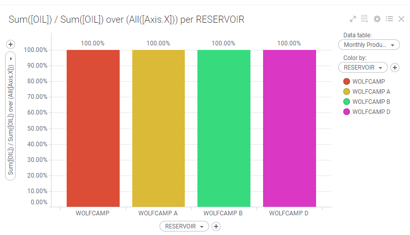
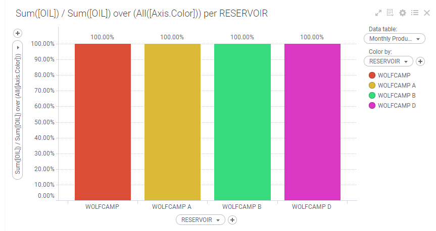
This is the same result as if I had changed the expression to Sum([OIL]) / Sum([OIL]) over (All([Axis.Color])). In both expressions, where RESERVOIR is on the x-axis, Spotfire sums oil for each node on the x-axis (the reservoir) and divides it by the total sum of oil for each reservoir, which results in 100%. You would think that it would calculate each reservoir as a percentage of the overall total. It does not because Axis.X is not referenced anywhere. Instead, Axis.Color tells it to divide the sum of oil for each node by the sum of oil for all of each color. Because the node and the color are the same, we get 100%.
Expression: Sum([OIL]) / Sum([OIL]) over (All([Axis.Color]))
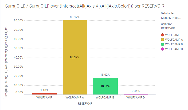
Thus, it makes sense that to get the desired end result, we would add Axis.X back into the expression. Now, I had a lot of trouble with this. In my experiments, I added in Intersect and Axis.X, but I was missing the node navigation. I’ve never written an expression that uses node navigation twice. The expression below is how we add color by to the original visualization. Big thank you to Shuting Fu at TIBCO support for helping me with this.
Expression: Sum([OIL]) / Sum([OIL]) over (Intersect(All([Axis.X]),All([Axis.Color])))
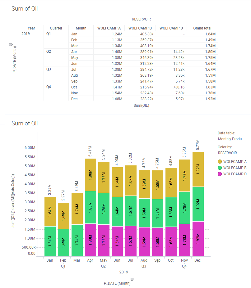
Finally, I have one more Axis.X example where the node and the color are not the same. Below, I have broken up the reservoir by field and positioned the bars side by side. You can see that the sum of each color equals 100%. This is taking the sum of oil for each field in a reservoir and dividing it by the total oil for everything that is on the x-axis. If these bars were stacked, the sum of the percentages wouldn’t make any sense, so it’s important to place them side by side.
Expression: Sum([OIL]) / Sum([OIL]) over (All([Axis.X]))
Okay, that’s enough of Axis.X. Let’s move on to Axis.Color.
Axis.Color on Bar Charts
Axis.Color is an option on bar charts, but it’s really better suited for line charts. First, I’ll show 2 of my early experiments that don’t make business sense, although they help explain how Axis.Color works. Then, I’ll give a reasonable example that I still wouldn’t put on a bar chart.
The Inner Workings of Axis.Color
The expression below is asking Spotfire to put the sum of oil for all colors onto a visualization. Because the expression asks for one number, the same total for the month repeats for each unique color value. This is not useful, but it helps us understand that Spotfire will take the result of the expression and place it on the chart for each unique value in color by.
Expression: Sum([OIL]) over All([Axis.Color])
When working with Axis.Color, node navigation methods relate to the colors and the order of the colors, which will come into play when using node navigation methods like Next and Previous. Below, the expression attempts to calculate the sum of oil for the previous color. Notice three key things…
- Wolfcamp A does not show up on the visualization at all. This is because there is no value “previous” to Wolfcamp A. It is the first value.
- The value shown for Wolfcamp B is actually the value for Wolfcamp A. This is because Wolfcamp A is “previous” to Wolfcamp B.
- The value shown for Wolfcamp D is the value for Wolfcamp B (expected given above), but it doesn’t appear until Wolfcamp D has data.
Expression: Sum([OIL]) over Previous([Axis.Color])

Thus, when using Axis.Color, be aware that that node navigation method is relative to the order of the colors as they come into Spotfire. You can change the order and how Previous and Next are interpreted by going into the Column Properties, Sort Order tab, and configuring a custom sort order.
A Useful Example
Finally, I want to show you a somewhat legitimate example of Axis.Color in a bar chart, along with a good reason to only use Axis.Color with line charts. In both charts, I placed the average oil production by well by month on the y-axis, along with an expression calculating the average oil production for all wells. The average of all wells is the yellow line. In the line chart, there are 3 yellow lines. Because they overlap, it appears as a single line. In the bar chart, the yellow lines duplicate and create an ugly, messy chart. Clearly, this proves my point.

Conclusion
Wow, when I started, I thought this was going to be a quick and easy post. It was not, but now I know more about how to use axis names on bar charts and about how Spotfire calculates. Also, I know not to use Axis.Color in bar charts. I’ll take it as a win!
Spotfire Version
Content created with Spotfire 10.3.
Other Posts in the Series
- Learning the Spotfire Expression Language
- Using the Over Keyword
- Node Navigation in Spotfire
- Using the Then Keyword
- Using the Intersect Keyword
- All, Next, Previous, AllNext, AllPrevious – Node Navigation
- First Node, Last Node, Last Periods, Previous Period, Next Period – Node Navigation
- Node Navigation – Parent & Parallel Period
- Node Navigation – NavigatePeriod
- $esc and $map functions
- What are Axis Names?
Pingback: Spotfire Axis Names on Line Charts » The Analytics Corner
Pingback: Use IronPython to Navigate Spotfire Pages » The Analytics Corner
Pingback: How to Use List Boxes in Spotfire Text Areas » The Analytics Corner
Pingback: How to Use Input Property Controls in Spotfire Text Areas » The Analytics Corner
Pingback: The Danger of Hiding Data in Spotfire » The Analytics Corner
Hi,
Can we combine bar chart (horizontal) with line chart in one visualization?
Thank you.
Yes, it’s a combination chart.
Hi Julie,
Thank you for your kind replying. I have tried to create the combination chart but it seems it works only for vertical one but not with horizontal one, could you please advise how can I create that with horizontal bar chart combine with line chart.
Thank you so much in advance.