Working with multiple scales in Spotfire visualizations can be a bit of a pain. I frequently find I have more scales than I need, and getting them synched up to the same min and max values can be frustrating. Last week, I built a project that allowed users to set multiple scale ranges with document properties. Not only does it give users more control, but it keeps multiple scales synched. It required a little bit of IronPython but was easy to setup. Read on to learn how.
Blog or Video?
I know many people prefer watching a video to reading a long post, so I am trying to do more with my YouTube channel. You can find all the content from this post in the video embedded below or thru this direct link to YouTube. I try to keep all videos to less than 10 minutes for Otherwise, just scroll down.
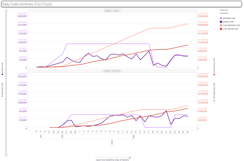
My Visualization
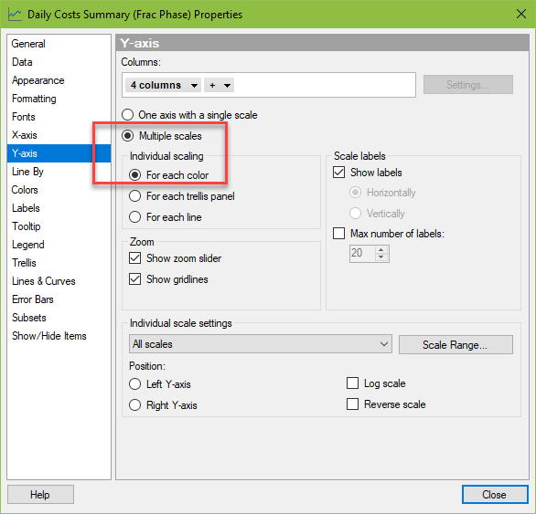
Here is the visualization I was working with. As you can see, I have four columns on my y-axis. I really want one scale on each side, but all of the options available to me for multiple scales lead to four scales (second screenshot below).
If I can’t get down to two scales, the scales on each side must have the same min and max. Otherwise, the chart is too hard to read. Every time the data updates, the scale range needs to change. Going into the properties dialog to adjust it is far too inefficient. I knew I could set the scale range with document properties and IronPython. I just needed a bit of code to get started.
Starting Code
Sayali Patel posted a TIBCO Community article on this subject that served as an excellent starting place. Her code did require a few modifications though. I wanted users to be able to update the ranges, rather than have them hardcoded. And, I also wanted to set the range for four scales.
# Copyright © 2017. TIBCO Software Inc. Licensed under TIBCO BSD-style license.

#Let's assume there are 2 columns "Sum([Col1]), Sum([Col2])" on the y-axis of a line chart. Color is set to (Column Names). The multiple scales for
#each color is turned on. Notice that there is a possibility to set different scale ranges using the drop down in the individual scale settings
#part of the property page. The naming of the two axes there are the same as the display name of the expressions on the axis (in this case Sum(Col1) and Sum(Col2)).

from Spotfire.Dxp.Application.Visuals import LineChart
from Spotfire.Dxp.Application.Visuals import AxisRange

#To set the axis range:
lChart = lineChart.As[LineChart]()
newAxisRange = AxisRange(-2000, 60000)
lChart.YAxis.IndexedRange["Sum(Col1)"] = newAxisRange

#To read the manually set axis range:


print lChart.YAxis.IndexedRange["Sum(Col1)"].Low
print lChart.YAxis.IndexedRange["Sum(Col2)"].High
My Modifications
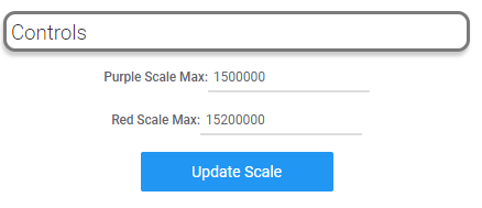
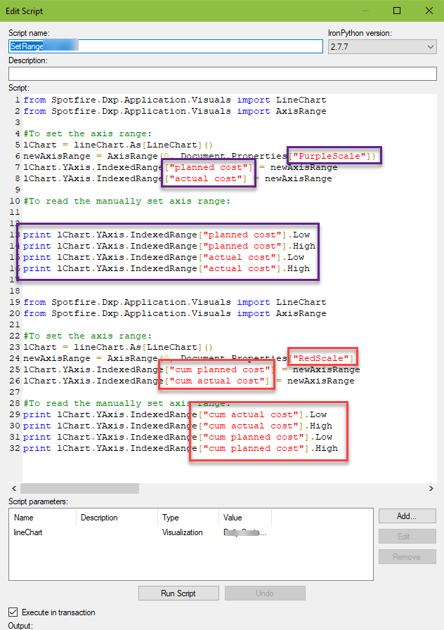
So, I created two document properties called PurpleScale and RedScale. They are input property controls using a Real data type.
Then, I modified the code as follows:
- Added a reference to the Document Properties in lines 6 and 24. Now the code will read the values in my Document Properties.
- Copied and pasted the code in line 7 into line 8 and entered in the names of my columns.
- Copied and pasted the print code to print the low and high values for each of my columns. This step is entirely optional. It just provides visual confirmation.
- Repeated steps 1 -3 for the second scale.
- Create a parameter to hook up the code to the visualization.
- Run the script.
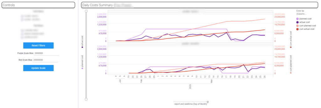
Here is the final result of my page. To change the scale, all the user has to do is update the property controls and click Update Scale.
This code is also easy to modify for other visualization types. I used the exact same code on a combination plot. All I had to do was swap out all references to LineChart for ComboChart. Use this handy reference to find the right API for your visualization. Now you know how to use IronPython to set multiple scale ranges with document properties.
Code Snippet for Copy Paste
from Spotfire.Dxp.Application.Visuals import LineChart
from Spotfire.Dxp.Application.Visuals import AxisRange

#To set the axis range:
lChart = lineChart.As[LineChart]()
newAxisRange = AxisRange(0, Document.Properties["PurpleScale"])
lChart.YAxis.IndexedRange["planned cost"] = newAxisRange
lChart.YAxis.IndexedRange["actual cost"] = newAxisRange

#To read the manually set axis range:
print lChart.YAxis.IndexedRange["planned cost"].Low
print lChart.YAxis.IndexedRange["planned cost"].High
print lChart.YAxis.IndexedRange["actual cost"].Low
print lChart.YAxis.IndexedRange["actual cost"].High

from Spotfire.Dxp.Application.Visuals import LineChart
from Spotfire.Dxp.Application.Visuals import AxisRange

#To set the axis range:
lChart = lineChart.As[LineChart]()
newAxisRange = AxisRange(0, Document.Properties["RedScale"])
lChart.YAxis.IndexedRange["cum planned cost"] = newAxisRange
lChart.YAxis.IndexedRange["cum actual cost"] = newAxisRange

#To read the manually set axis range:
print lChart.YAxis.IndexedRange["cum actual cost"].Low
print lChart.YAxis.IndexedRange["cum actual cost"].High
print lChart.YAxis.IndexedRange["cum planned cost"].Low
print lChart.YAxis.IndexedRange["cum planned cost"].High
Spotfire Version
Content created with Spotfire 10.2.
Hi Julie,
Love your blog! Definitely the best way for oil and gas professionals to improve spotfire skills.
Unrelated to this post-have you covered using Spotfire to correctly pivot on API10? I have noticed a few errors(i.e. the later completion dates not consistently in order). I have tried column sort of API14 but does not seem to stay in that order when I Pivot to API10. If you have covered this please link. Thanks!
Hi Kate, thanks for commenting. Spotfire reads rows into the application based on the order of records in the database. If you are working with an information link, you can add order by clauses that will sort the data as it is coming in. That’s the order it will stay in throughout the analysis. I have worked on this problem before, and I created a step in my process that showed where API10 had duplicate records (API14 would have been different wells). Then, the user had to choose which one they wanted. Hope that helps.
The sort function is really only applicable to a table visualization and doesn’t impact any of your transformation processes and won’t “hold” as you noted. The sort with the order by clause will “hold”.
Hi, do you have any idea why my code is not working for my combination chart?
I get this error:
Traceback (most recent call last):
File “”, line 5, in
AttributeError: ‘type’ object has no attribute ‘As’
from Spotfire.Dxp.Application.Visuals import CombinationChart
from Spotfire.Dxp.Application.Visuals import AxisRange
#To set the axis range:
lChart = CombinationChart.As[CombinationChart]()
newAxisRange = AxisRange(0, Document.Properties[“Revenue”])
lChart.YAxis.IndexedRange[“Gross_RevOil”] = newAxisRange
lChart.YAxis.IndexedRange[“Gross_RevCond”] = newAxisRange
lChart.YAxis.IndexedRange[“Gross_RevGas”] = newAxisRange
lChart.YAxis.IndexedRange[“Gross_RevLiquids”] = newAxisRange
#To read the manually set axis range:
print lChart.YAxis.IndexedRange[“Gross_RevOil”].Low
print lChart.YAxis.IndexedRange[“Gross_RevOil”].High
print lChart.YAxis.IndexedRange[“Gross_RevCond”].Low
print lChart.YAxis.IndexedRange[“Gross_RevCond”].High
print lChart.YAxis.IndexedRange[“Gross_RevGas”].Low
print lChart.YAxis.IndexedRange[“Gross_RevGas”].High
print lChart.YAxis.IndexedRange[“Gross_RevLiquids”].Low
print lChart.YAxis.IndexedRange[“Gross_RevLiquids”].High
Hi, can you explain what the code in line 5 means? lChart = lineChart.As[LineChart]()
I tried replacing LineChart to CombinationChart and it is not working.
lChart and lineChart are objects.
LineChart is the API reference.
Here is the code I used for my combination chart.
#To set the axis range:
cChart = combinationChart.As[CombinationChart]()
newAxisRange = AxisRange(0, Document.Properties[“GreenScaleS2”])
cChart.YAxis.IndexedRange[“avg stages per day”] = newAxisRange
cChart.YAxis.IndexedRange[“actual stages per day”] = newAxisRange
cChart.YAxis.IndexedRange[“planned stages per day”] = newAxisRange
The error was due to the script parameter name not matching the code in line 5. Thank you for this great tutorial!
Glad you got it worked out and that the tutorial was helpful!
Julie, if my columns plotted on Y-axis are custom expressions, how do i find out what their names are to be able to refer to them with IndexedRange[“???”]. Thank you so much!
Include — as [Column Name] — in your custom expression, and then refer to it by that name.
Hi Julie, I starting learning how to use Spotfire less than one year ago and your blog has been my “go to site”. I have a related question to this original posting.
I have a page that has several bar or combination charts on it. I need to be able to set all these charts “Y” axes to the same “min” and “max” values. I used your approach above and was able to create a iron python script that would set the “min” and “max” values for one visualization on this page, but I have not figured out how to “loop” through the other visualizations on the same page and set their “Y” axis to the same “min” and “max” values. The “min” and “max” values are set by document properties. Following is the code I have so far:
from Spotfire.Dxp.Application.Visuals import VisualContent
from Spotfire.Dxp.Application.Visuals import AxisRange
#To set the axis range:
viz= viz1.As[VisualContent]()
viz.YAxis.Range = AxisRange(Document.Properties[“YAxisMin”],Document.Properties[“YAxisMax”])
I found the following ironpython script snippet to loop through all the visualizations on the active page:
#On this page, loop through every visual
for visual in Document.ActivePageReference.Visuals:
However, I do not know how to set use this snippet within the Script above to set all “Y” axes the visualizations on the same page. Any ideas on how to accomplish this?
I have a different script that does this. I just need to find it.
This is great! A big life saver. Thanks Julie
You’re welcome!
Hi Julie,
Regarding these lines below, how does one update for bar chart and if indexed range is from a document property how does the syntax change, I’m really bad with iron python syntax and adding in the document. Properties [] after .IndexedRange doesn’t work:
lChart.YAxis.IndexedRange[“planned cost”] = newAxisRange
lChart.YAxis.IndexedRange[“actual cost”] = newAxisRange
#To read the manually set axis range:
print lChart.YAxis.IndexedRange[“planned cost”].Low
print lChart.YAxis.IndexedRange[“planned cost”].High
print lChart.YAxis.IndexedRange[“actual cost”].Low
print lChart.YAxis.IndexedRange[“actual cost”].High
Thanks,
S
I threw together a quick example using the following code to set the upper limit of a y axis range on a bar chart. The print command gives the right values and the script does not error BUT the visualization isn’t updating, which I don’t understand. Did you actually get an error message?
from Spotfire.Dxp.Application.Visuals import BarChart
from Spotfire.Dxp.Application.Visuals import AxisRange
#To set the axis range:
bChart = barChart.As[BarChart]()
newAxisRange = AxisRange(0, Document.Properties[“HighRange”])
bChart.YAxis.IndexedRange[“Prod”] = newAxisRange
#To read the manually set axis range:
print bChart.YAxis.IndexedRange[“Prod”].Low
print bChart.YAxis.IndexedRange[“Prod”].High
Hi Julie, thanks for the response!
I was able to get it working using the ff syntax for the Left Axis:
bChart = barChart.As[BarChart]()
leftAxis = AxisRange(0, Document.Properties[HighRange])
bChart.YAxis.IndexedRange[Document.Properties[LeftYAxisScale][0]] = leftAxis
— then I set script parameters barChart to my visualization & ‘HighRange’ to the string value of my input field property control name & ‘LeftYAxisScale’ to the string value of my Left Axis property control name —
Nice work. Thanks for sharing!
Hello Julie,
Have you assigned an IndexRange to a ‘Multiple Scales (for each color)’ that uses multiple columns/a hierarchy for the ColorAxis?
I can assign colors by referencing the ‘leafs’ of the hierarchy like “factory1.planned cost”, but that doesn’t seem to be enough to reference the IndexRange (assigning to a non-existent key will make a new IndexRange, although it will have no impact on the chart).
Even being able to print the existing references would help, but trying to print information from the IndexedAxisRange object generally crashes my code.
I like that suggestion.
An alternative solution to this would be to concatenate the columns into a new column and use that as your ColorAxis/LineByAxis, which is what I ended up doing, after a long fight to do it a “normal” way. So no need to investigate this further, but I hope it is helpful for others.
Good suggestion. Thank you.