Last week, I was on a family vacation, so there were no blog posts. This week, I return to wrapping up my mini-series relations and column matches. The series began with an intro to relations and column matches. Then, I provided all the details needed to effectively use column matches. This week, I’ll explain how to use relations in Spotfire with the same level of detail.
As a reminder, relations are used to integrate marking and filtering across data tables. This is distinctly different from column matches, which are used to place data from different tables on a single visualization and calculate across tables.
Where to Find Relations
Users create relations and column matches from the Data Table properties dialog, within the File menu. Like column matches, relations have their own tab. The dialog will be blank by default. Unlike column matches, users must create all their own relations.
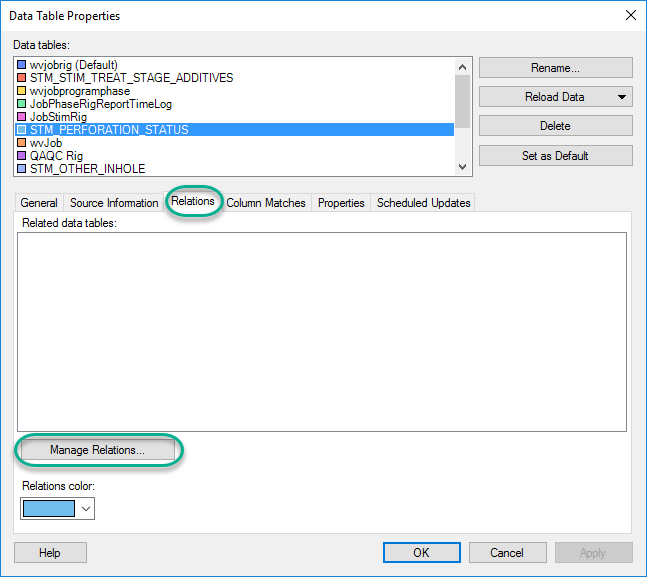
Once creating a column match, a new grid icon will appear in the filter panel. This grid icon controls how integrated filtering will work. I’ll discuss it farther below. The grid icon is the only visual control within the application to indicate relations are being used. There used to be bands of color in the filter panel and in the title bar corresponding to the Relations color shown in the screenshot above, but it appears that changed with Spotfire 10.
How to Use Relations
Which Columns to Relate
The most important thing to understand in how to use relations in Spotfire is which column(s) to relate. Many users get stuck with relations because they just don’t know which columns to relate. Just like column matches, you don’t need to relate all of your columns. Rather, you need to relate the ones you are using in integrated filtering and marking. More specifically, to use integrated filtering, you must relate the columns of data you want to filter on. That’s how Spotfire knows that Well A in your header table is the same as Well A in your production table, for example. For integrated marking, relate the columns of data on the visualization. Before we take a look at examples, let’s review the data set.
The Data Set
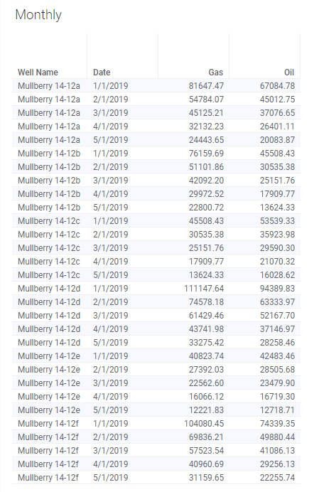
This week’s data set is similar to the data used for column matches. I added a few wells. Some of them are in both tables. Others are not. I’ll explain before each example. We are still working with two tables — a daily production table and a monthly production table with data from 1/1/2019 to 5/31/2019. All data is fictitious.

Let’s take a look at integrated marking. For all integrated filtering and marking examples, I will show you two visualizations — one connected to the daily table and one connected to the monthly table. I will change the columns of data on the x-axis in relation to the related columns to show you how the visualization is impacted by the relations.
Integrated Marking
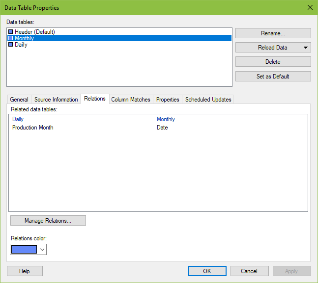
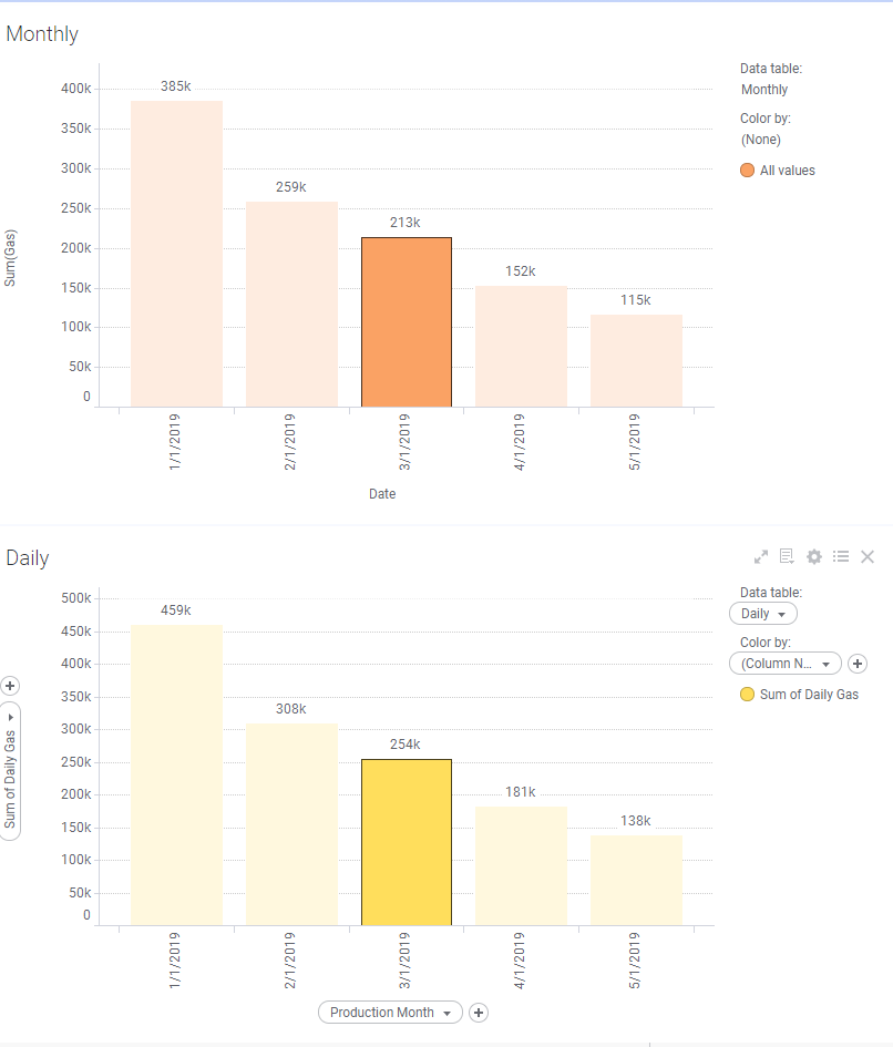
For the first example, I created a relation between Date (daily table) and Production Month (monthly table). Scroll up if you need to refresh on what this information is.
Below, you can see two visualizations with the dates on the x-axis. Because they are related (on the date), I can mark one and the other is also marked.
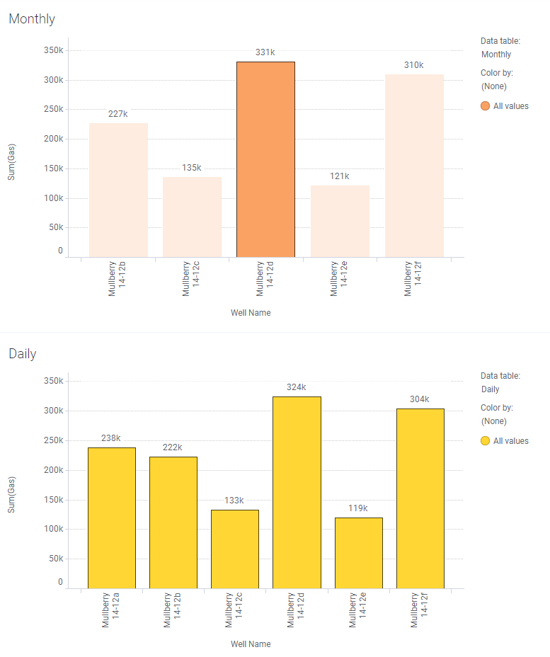
Now, to illustrate the importance of which should be related, I have changed the visualization. Instead of dates on the x-axis, I added well names. Then, I marked the monthly visualization. Because I don’t have a relation on well name, the daily visualization is NOT marked.
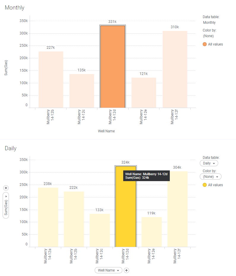
If I add another relation on the well name and then mark the monthly visualization, the daily visualization is now also marked.
Thus, for integrated marking, you must create relations on the columns of data that are common across tables AND used on both visualizations marked.
Next, let’s look at integrated filtering.
Integrated Filtering
Settings for Integrated Filtering
For integrated filtering to work, there is one additional step to take. The user must specify HOW filtering should be integrated by clicking on the grid icon in the filter panel and making a selection.
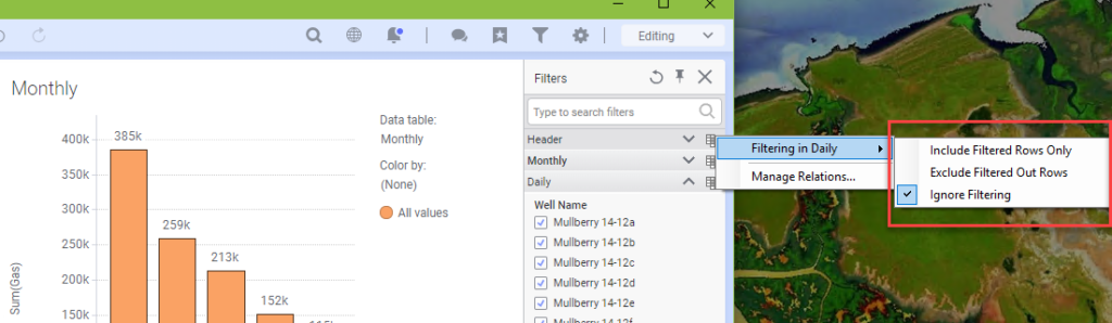
There are three options:
- Ignore Filtering (Default setting, ignore filtering in other tables)
- Include Filtered Rows Only
- Exclude Filtered Out Rows
Before explaining each individual option, I want to explain how to interpret the grid icon. When I click on the grid icon for the monthly table, it’s saying, “What happens to the monthly table (and only the monthly table) when I filter in the daily table.” When I click on the grid icon for the daily table, it’s saying, “What happens to the daily table (and only the daily table) when I filter in the monthly table.
Thus, changing the setting in the monthly table only impacts the monthly table. If you want to be able to filter on either the daily table or the monthly table and impact the other, you must change settings in both tables. This can get dangerous if the two tables don’t have the same unique values in related columns. I’ll talk about that in the Pitfalls section below.
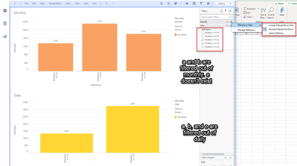
In order provide good examples, I have added/subtracted data to each of the tables.
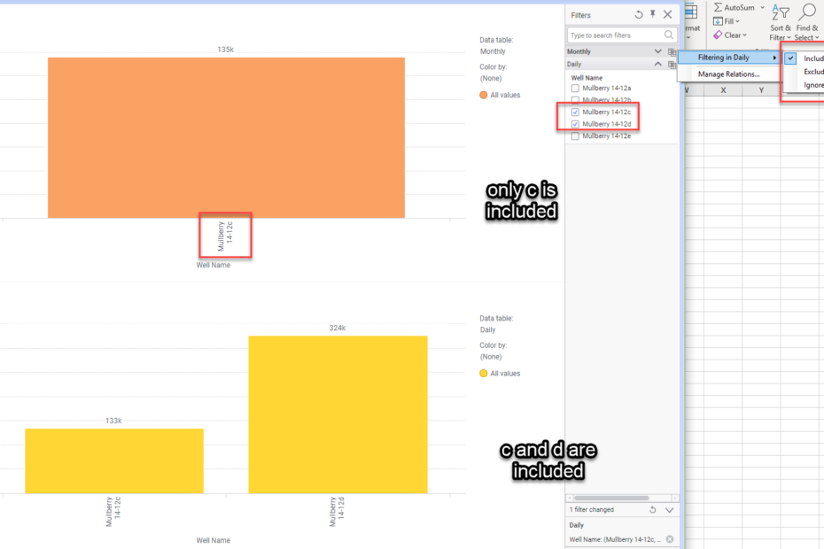
The daily table contains Mullberry 14-12a, Mullberry 14-12b, Mullberry 14-12c, Mullberry 14-12d, and Mullberry 14-12e. The monthly table contains Mullberry 14-12a, Mullberry 14-12b, Mullberry 14-12c, and Mullberry 14-12f, Mullbery 14-12g. To summarize, wells a, b, and c are in both data sets. Wells d and e are in daily, not monthly. Wells f and g are in monthly, not daily. Let’s look at each setting.
Exclude Filtered Out Rows
Below, I have used the daily table well name filter to reduce the data set to wells c and d (filtered out a, b, and e). As you can see, a and b are gone from the monthly visualization. E doesn’t exist in the monthly table, so there was nothing to remove. Most importantly, wells f and g still show up in the monthly visualization. This is different from what happens using Include Filtered Rows Only. To contrast, let’s look at the same visualization with the setting set to Include FIltered Rows Only.
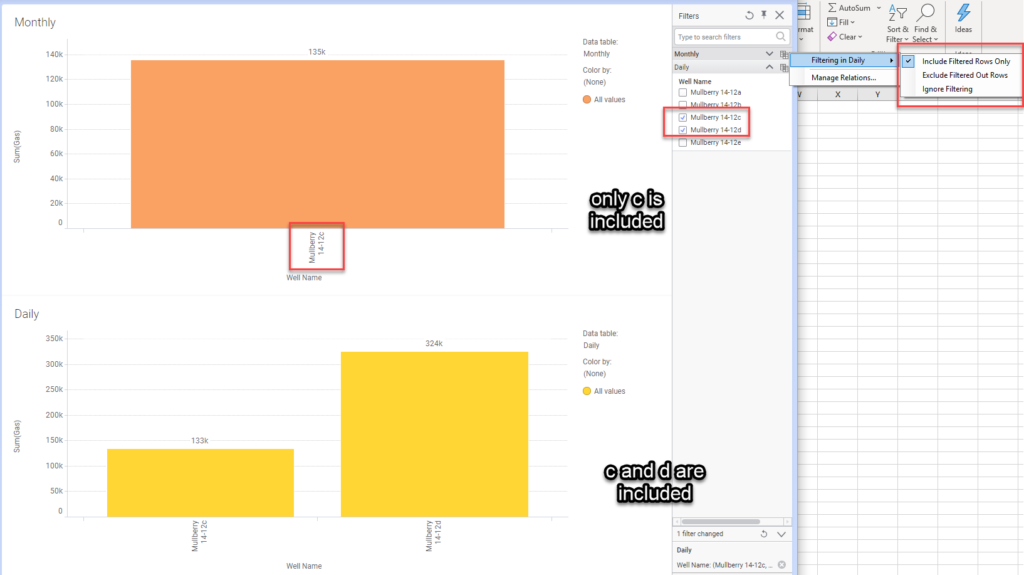
Include Filtered Rows Only
Here, I’ve changed the setting for filtering in the monthly table to Include Filtered Rows Only. My filter is still set the same, meaning I have filtered to show only wells c and d. With this setting, the monthly visualization only shows well c. This is because only wells a, b, c are common across the two tables. Spotfire is “including filtered rows only.” Because wells f and g are not in the daily table, they are not shown on either visualization.
I realize the screenshots might be a bit small and hard to read, so here’s a video you can expand and follow along at your own pace.
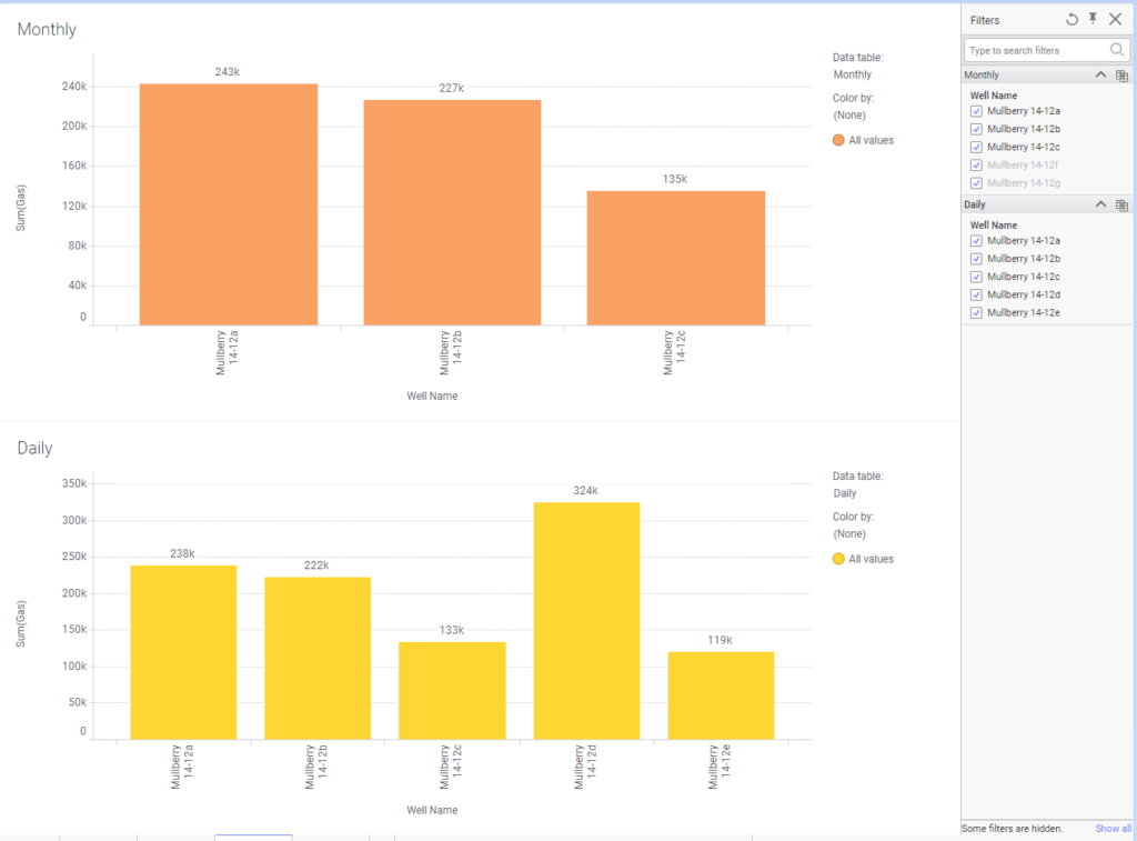
Potential Pitfalls
It is possible to get into trouble when using the Include Filtered Rows Only setting if related data tables don’t have all the same unique values. As you can see in the example below, I have the monthly table set to Include FIltered Rows Only. Because wells f and g don’t exist in the daily table, they are not on the visualization. They are also grayed out in the filter. Resetting filters doesn’t change this. This may be a no go for some use cases.
Conclusion
When I first started using relations and column matches, I didn’t understand why they were separate functions. I also didn’t understand why Spotfire would create column matches for you and not relations. Shouldn’t you be able to do all these things with one function? Well, there are no consequences for having Spotfire create column matches for you. However, there are consequences for creating relations if you don’t understand what relations do. Marking would be automatically integrated, which users might find confusing. By making users creating their own relations (and setup how related data should work together), the user understands what’s going on in their DXP.
Now that’ you’ve read thru this post, I hope you feel like you know how to use relations in Spotfire.
Spotfire Version
Content created with Spotfire 10.2.
Pingback: Compare Data in Tables Using Lists » The Analytics Corner
Hi Julie,
Such a beautiful way to explain relations.. I just loved it.
I have a set of 3 data tables and how do i relate these 3 together. Also, if you can explain the same using table/cross table that helps!
Thanks,
Laxmi
I created 2 blogs posts, one on how to use relations, which is the article you are commenting on, and another on how to use column matches. They perform similiar functionalities but are separate pieces of the application. Relations control filtering across tables. Column matches control marking across tables and allow you to put data from different tables one visulaization. You asked the question – “How do I related these 3 together?” That is what the blog post is showing, so I don’t know how to answer your question without just referring you back to the blog post. Can you be more specific? You also asked if I could explain the same using table/cross table. It doesn’t work that way with cross tables because cross tables are visualization types. A “table” is a visualization type as well but it is sort of the underlying data structure on which all other visualizations are based. Therefore, you wouldn’t do anything differently to relate cross tables. You relate the data tables and the visualizations take care of themselves.
Nice Article !
relations with external data using oracle connection shows error when filtering is applied “Filtering in related table could not be applied”. although I added the related columns.
Amazing article, thank you so much!
If both tables do not share a variable (e.g. well name), is there a way I can still filter by well name? For example, if I set up a relation btw. Table 1 and Table 2 based on API14, how can I filter Table 2 based on well name in Table 1? (Table 1 contains well name but Table 2 does not). Thanks!
No, they have to share something.