Last week, I wrote a summary post explaining the differences between relations and column matches. This week, I’ll really teach you how to use column matches. Next week, I’ll cover relations. I also have a couple “Pro Tip” posts brewing.
Just as a reminder, users apply column matches for the very specific purpose of putting data from different tables on a single visualization. They also allow users to create calculations across tables. So, let’s get to it!
Where to Find Column Matches
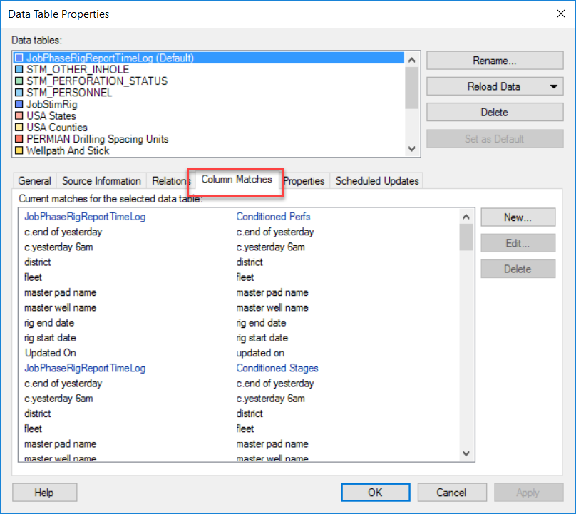
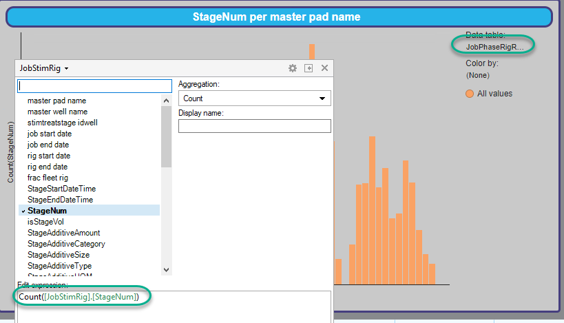
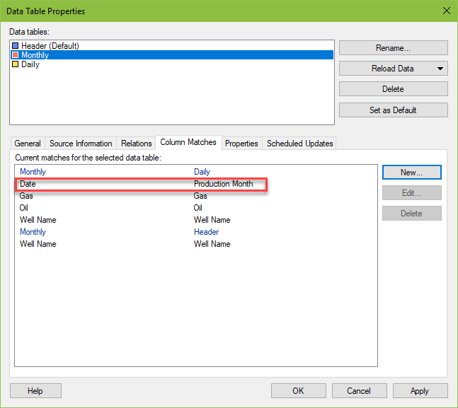
Column matches are found in the File menu – Data Table Properties – Column Matches. Most importantly, Spotfire will create them automatically when the column name and data type are the same. The case does not have to be the same, as you can see in the last column match for “Updated On” in the first pairing of tables. I did not manually match these two columns. Spotfire created this match.
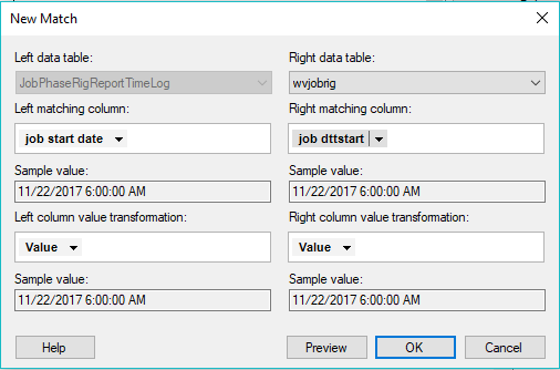
Columns can easily be manually matched by clicking on the New button.
When working with a visualization, you will know column matches exist by the presence of a drop-down in the top left-hand corner of any column selector as shown here. If there are no matches, or if you only have one table in the DXP, the drop-down won’t be there.
Also notice that when you use this drop-down menu to select a column of data, the table name is included in brackets before the column name, separated with a period.
Now that you understand some of the basics, let’s apply it.
Creating Visualizations with Data from Different Tables
Which Columns to Match
Now, many users get stuck with column matches because they don’t know which columns to match. Surely, you don’t have to match all of them…right? No, of course not. You must match on the columns used to slice and dice the data. What exactly does that mean? Well, the answer varies depending on the visualization type and configuration.
For example, on a bar chart, you’ll match on the x-axis column(s). For a cross table, match on the column(s) on the vertical axis. You’ll also need to match any columns used to color by, trellis by, etc. Before we look at examples, let’s review the data set we’ll be working with.
Data Set
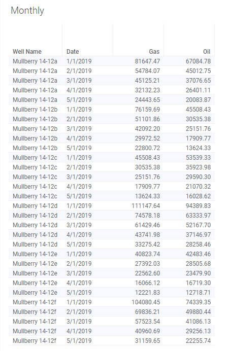
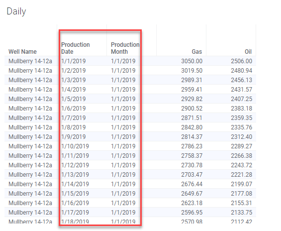
The data set consists of two tables. One contains daily production data for 5 wells from 1/1/2019 to 5/31/2019. The other contains monthly data for the same wells and time period. Note, all data is fictitious.

Bar Chart Example
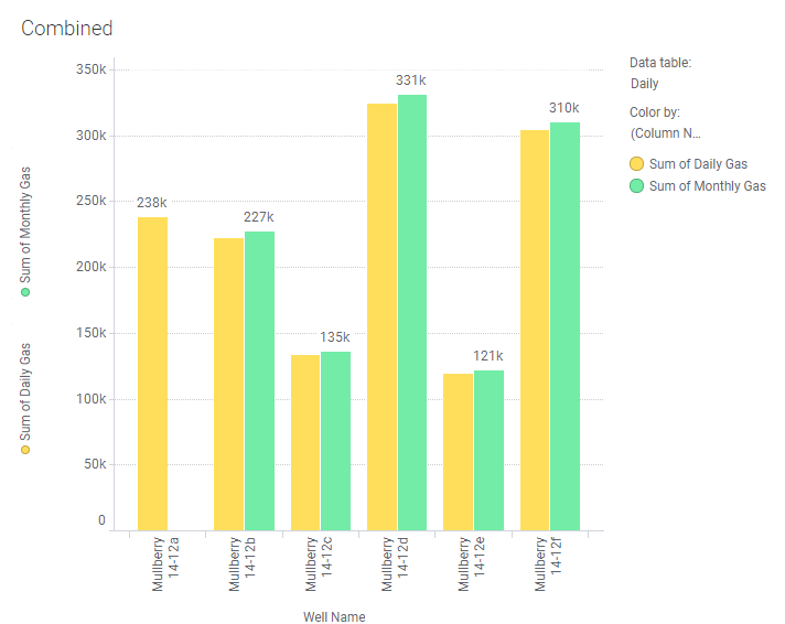
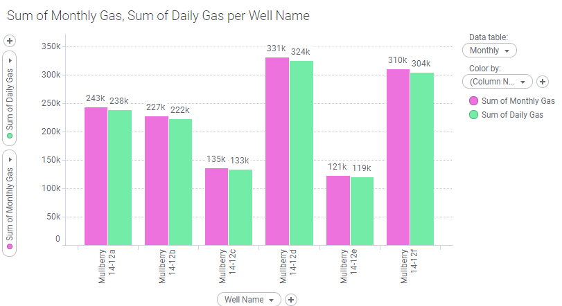
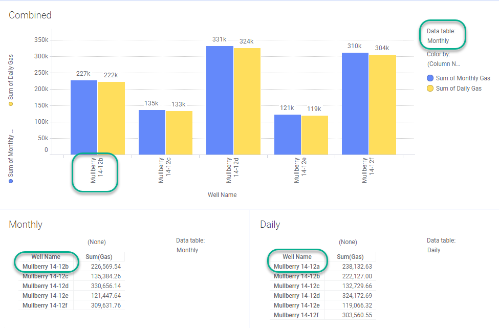
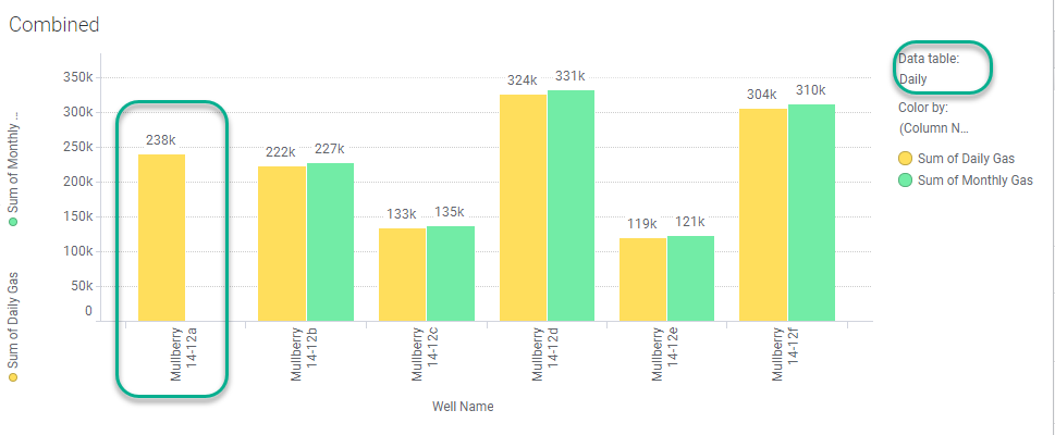
I created a bar chart showing the sum of daily and monthly gas. Note, the data table is set to the Monthly table, but it could also be the Daily table, and the result would be the same. This chart shows the end result, but just scroll down a bit for a video demo.
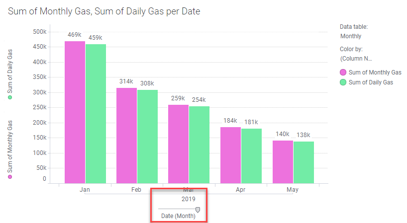
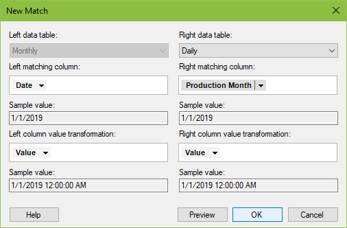
To create this chart, I matched the Date column (in the Monthly table) and the Production Month column (in the Daily table).
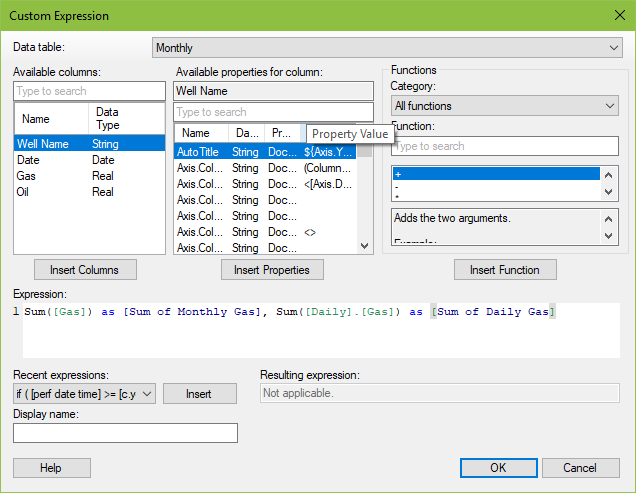
Right-click on the y-axis and select Custom Expression to see the precise syntax. This includes the table name for the column of data housed in a different table.
Below, I have changed the x-axis to Well Name. The chart still works because Spotfire created the Well Name match for me based on the column name and data type.
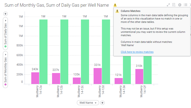
If a match is needed, Spotfire will warn you with a yellow warning symbol in the title of the visualization. Don’t ignore these! I generated the error below by manually deleting the match on Well Name. If this pops up, your data will not be correct.
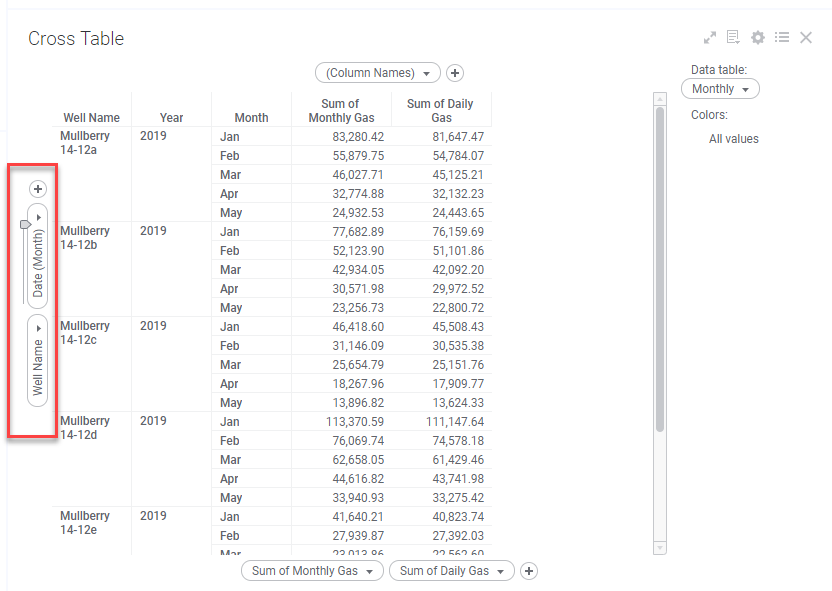
Cross Table Example
For a cross table to work with the date and the Well Name, I would need to create matches on these two columns. Fortunately, I have them already.
Calculating Across Tables
Only a small modification is needed to calculate across tables. In the short video below, I demonstrate how to calculate the difference between the daily and monthly totals.
Now that you understand how to use column matches, let’s talk about a few potential issues you might run into.
Potential Problems
1. Missing Data
Users will encounter problems if data is missing between matched columns. How that problem materializes depends on which table the visualization is set to and which table the data is missing from.
To illustrate, I have deleted all of the monthly data for Mulberry 14-12a. Because the main data table is the Monthly table, Mulberry 14-12a doesn’t appear on the visualization at all, even though it has daily data. This is a bit of a trap. If you don’t know data is missing, the visualization doesn’t tell you. However…
When the data table is set to the daily table, it is apparent that the monthly data is missing.
This is a really important detail to be aware of when working with data in separate tables.
2. Different Levels of Granularity
I would also exercise caution when working with tables that have different levels of granularity. The data sets used in this post are a good example. I created the Production Month column in order to account for the different granularities of my tables.
3. Time Stamps
If you match on a DateTime column, the time stamp must match exactly in both columns. When I first started working with column matches, I tried to use them on a DateTime column where I really only wanted to match on the date. I didn’t care about the timestamp, but Spotfire is precise. I had to create new columns without the time stamp to match on instead.
Conclusion
That concludes this week’s post on column matches. This post was a bit long, but it is thorough in terms of what you need to know to work with column matches. Next week, I’ll provide the same level of detail for relations.
Spotfire Version
Content created with Spotfire 10.2.
If You Enjoyed This, Check Out
If you enjoyed this, check out some of my Pro Tip posts.
Pingback: How to Use Relations in Spotfire » The Analytics Corner
Pingback: Compare Data in Tables Using Lists » The Analytics Corner
Pingback: Rearrange Visualizations Using Bookmarks » The Analytics Corner